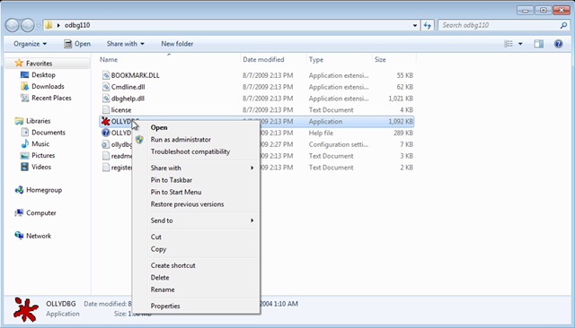
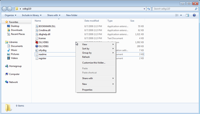
While reading this post I’ve remembered a quirk of the Windows 7 UI which annoys me to no end: you have to click on a non-empty part of the list to get the item-specific menu, otherwise you will get the folder-specific menu, as shown in the second screenshot:
This is in fact consistent with the way the Windows XP UI works, with a small, but important, difference: under Windows XP you do not get the impression that the whole row is selected (and, in consequence, it should work the same), while under Windows 7 you do.
Win 7 is a big step forward (do not run Vista! do not run Vista!), but it still has its glitches (the glowing-animating progress bar is pretty annoying also).

