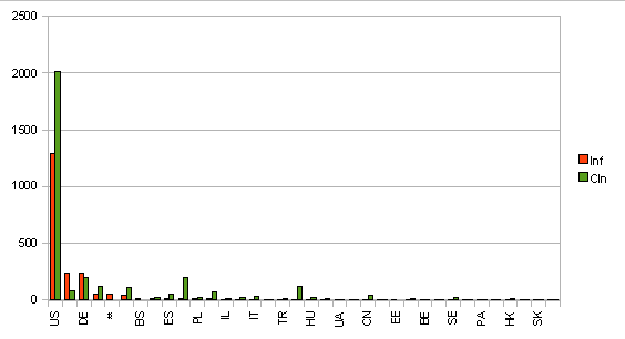
In an earlier post I’ve said that the number of malicious sites in a country has a close relation to the level of connectivity in the given country. Here is a chart to show this visually:
(The data collection method is the same as for the other data: malicious domains from DNS-BH and clean domains from Alexa)
As you can see, the most malicious sites are from the USA, as are the most clean sites. For an other chart look at Stopbadware.org (their site shows China in the first places followed by USA).
PS. The latest FireEye blogpost says that they are not trying to pick on the eastern bloc intentionally. Thank you guys 🙂
